The Time Machine – 1960 (WINNER)

I really liked this movie. The visuals were creative, fanciful, fun, and a feast for the eyes. They gave audiences multiple images and effects that the world had never before seen. But that isn’t to say they were all perfect. They were not. The film’s extraordinary production design helped to enhance the visuals, but there were too many times when I was taken out of the story because of sub-par special effects.
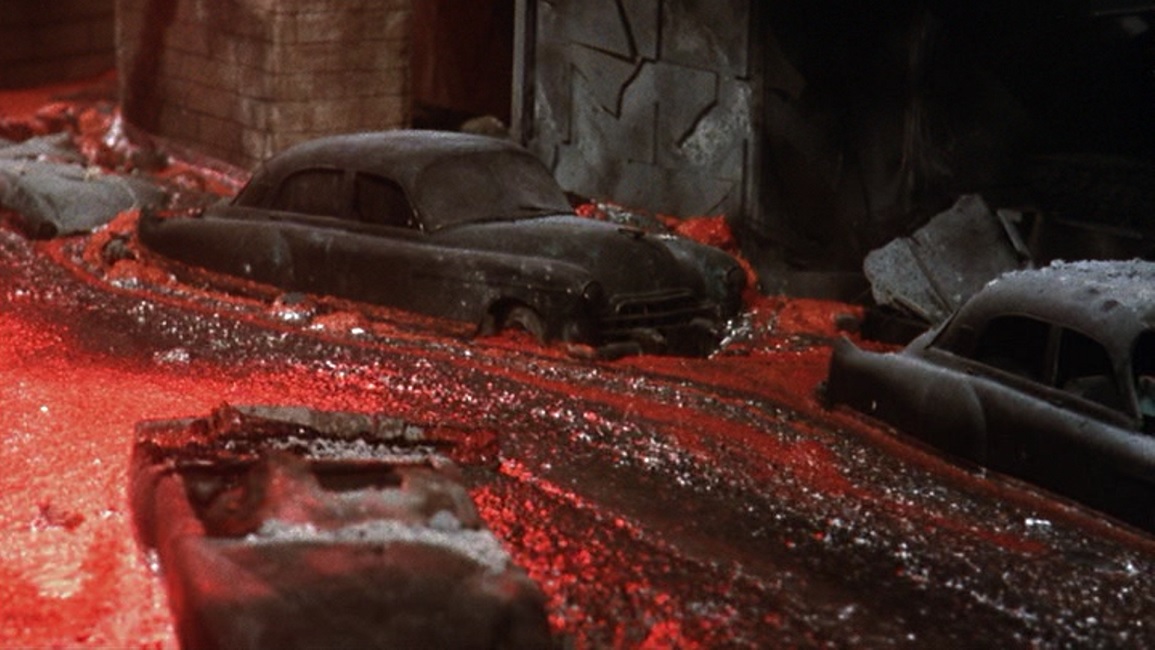
For example, the scene in which the volcanoes erupt and flow down the street of a city. While it was a cool effect to watch, it was painfully obvious that the filmmakers were using scale models. The cars looked too much like toys and the lava looked too much like viscous mud under a red lighting gel. It looked bright and interesting, but completely fake.
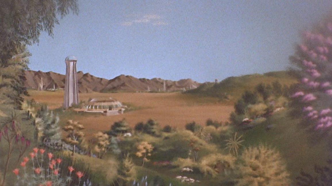
Next, there was the matte painting of the landscape of the extreme future. It was a painting that looked like a cross between the styles of Thomas Kinkade and Bob Ross. Once again, it was beautiful, but it also looked entirely unreal. This example stands out even more than the other, because we first see the fantasy terrain in oils, then we cut to a shot of our hero walking amongst real the foliage. It was so different, it got me thinking about the inconsistency of the images, instead of being immersed in the story.
But fortunately, the film had more good special effects than bad. One of the earliest effects in the narrative was when the character of H.G. Wells starts his journey forward through time. I think they used a blend of two different effective techniques. First was a form of stop motion or single image animation. They had a fast stream of separate rear-projected images shown in such quick succession as to appear to be a quickly morphing moving picture. The second was actual time lapse photography, showing the world around the machine moving at incredible speeds.
I liked the way Wells observed a mannequin and her quickly evolving display of ladies fashions, and the way he could see the sun speeding past his skylight. I liked the way the mountains rose up around him as he sped forward in time, only to crumble away as the rocks are worn down by the ravages of centuries. The matte painting of the giant head atop Morlock temple looked ominous and forbidding.
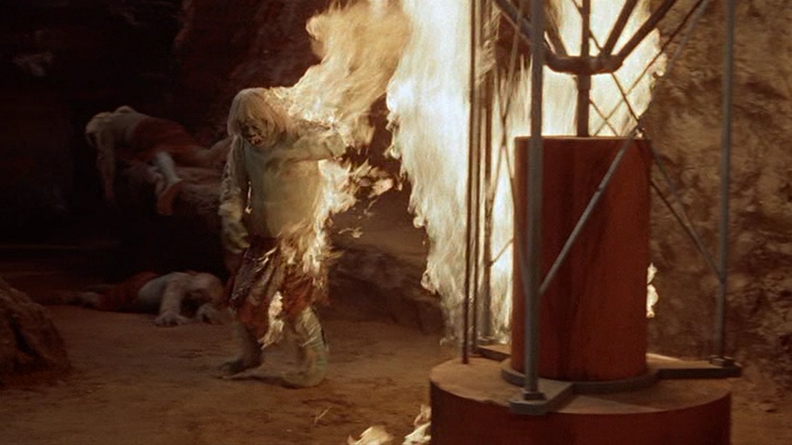
I also really liked the burning of the Morlocks’ cave. They actually set a stunt man on fire and kept him on the screen for several seconds before allowing him to rush through a doorway where, I’m sure, men were waiting with fire extinguishers. But I think that the film’s best effect might have been the accelerated decaying of the dead Morlock body. It looked incredibly complex and fairly realistic, and I was properly impressed. In other words, despite the bad scale models and the painted landscapes, I think that this movie was a deserving Oscar winner!