Alice in Wonderland – 2010

A live action adaptation of the well-loved fantasy story of Alice in Wonderland seems like a shoe-in for a visual effect extravaganza. And to be clear, this was exactly that… however, while they were incredibly well-done, I felt the visuals were too cartoonish to achieve the photo-realism that I think the filmmakers were going for. It was clearly a step above computer generated cartoon animation like the Toy Story movies, and yet a step below believable live-action/CGI blends like Avatar.
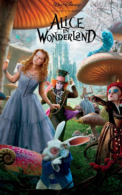
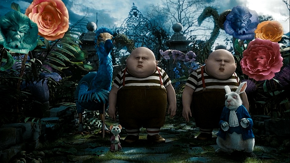
There were characters in the film that were completely real, like Alice. Then there were partially real characters like the Queen of Hearts and the Mad Hatter. And finally, there were the completely CGI characters like the March Hare and the Cheshire Cat. The same could be said about the fantasy environments and many of the props. The problem is that I’m not sure if this inconsistency was intentional. At times, it was as if the director, Tim Burton, didn’t wanted his audience to forget that most of what they were seeing on the screen was animated. He didn’t seem to want true photo-realism all the time. As a result, there was a bit of a disconnect in my brain when I watched it. And yet, I must admit that a certain unbelievable mix of reality and imagination was a theme in the film’s plot.
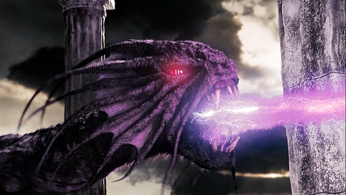
I think that the worst offender of this was the Jabberwocky. Sometimes he looked very life-like, at others, he looked like a miniature scale puppet, the kind that was once used in stop-motion animation, and at other times, he looked and moved like a very obviously CGI creature. And he was supposed to be the climax of the movie.
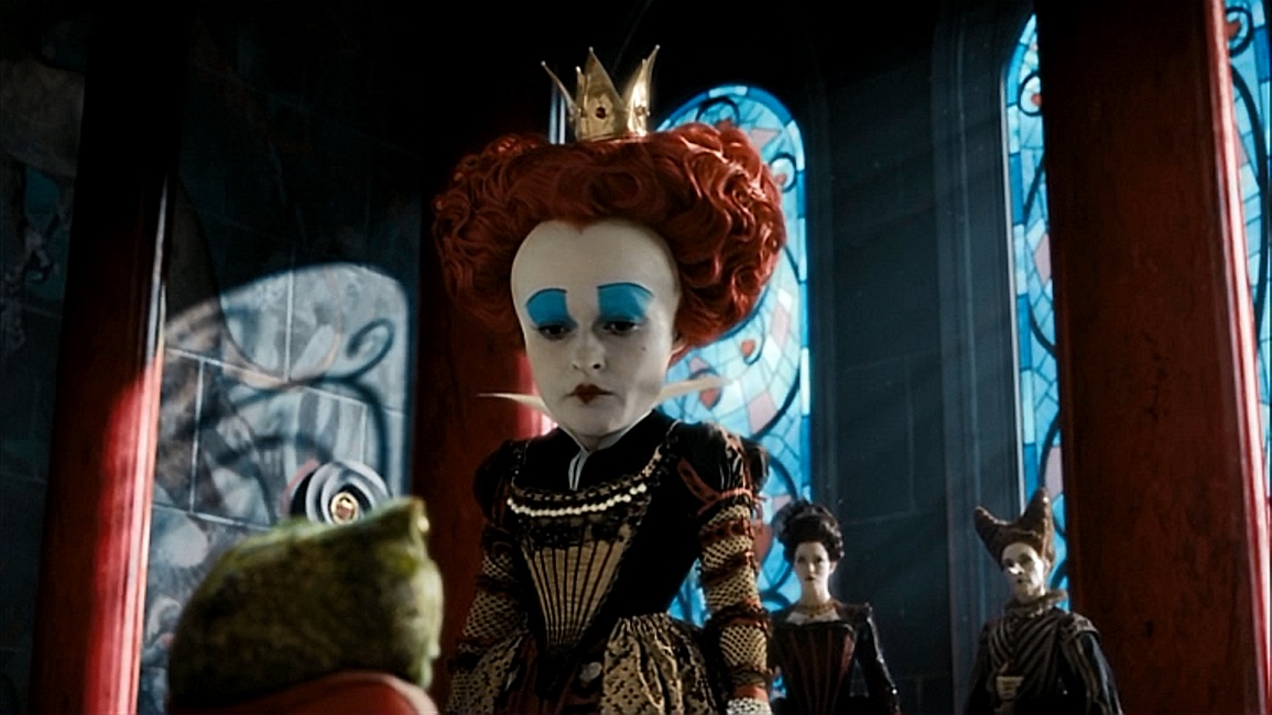
That’s not to say the effects weren’t interesting and innovative. They were. One of the most interesting effects in the movie was how they were able to digitally stretch, augment, and enhance the faces and bodies of their live actors, giving them, for example, the ability to keep the actors’ actual facial performances, while giving them CGI bodies, or, in the Queen’s case, just making her head to big for her body. It was a great effect, and it was rather ingenious how they were able to digitally taper down her enlarged neck to blend with the normal-sized shoulders and torso. They used a similar technique to make the Mad Hatter’s eyes larger, giving him a look that was just a little more insane.
Another issue that the filmmakers had to deal with was that of size, as Alice continually grew and shrunk as part of the plot. For the most part, this was done pretty well. And the completely digital environments were done very well. As I have come to expect from Tim Burton, they were a fantastic mix of the beautiful and the horrific. I especially liked the interior of the Queen of Heart’s throne room, and the large exterior shots of both her castle and the White Queen’s castle. The throne room had stained glass windows that were masterfully created, casting light and shadows in all the right ways. For all the inconsistencies, whether they were intentional or not, the film has a very unique look. I believe it deserved its Best Visual Effects nomination, but I’m also glad that it didn’t win.