1963 – Cleopatra (WINNER)

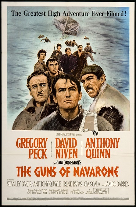
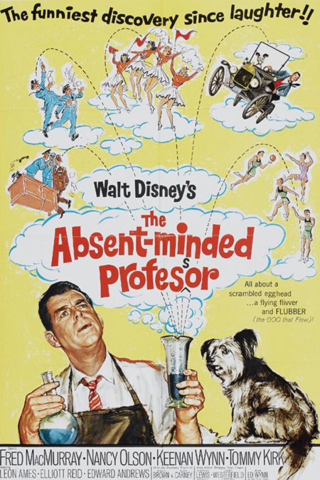
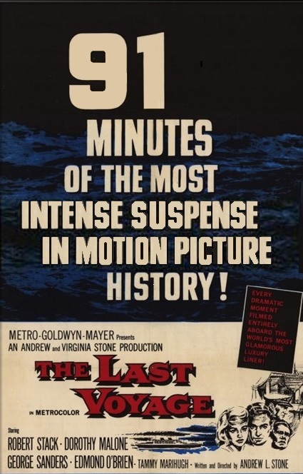
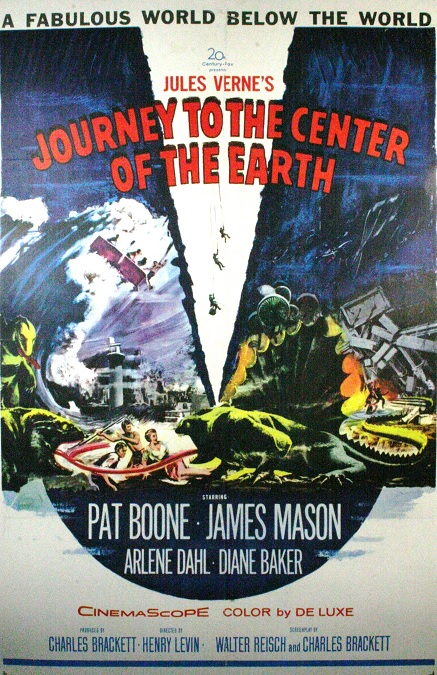
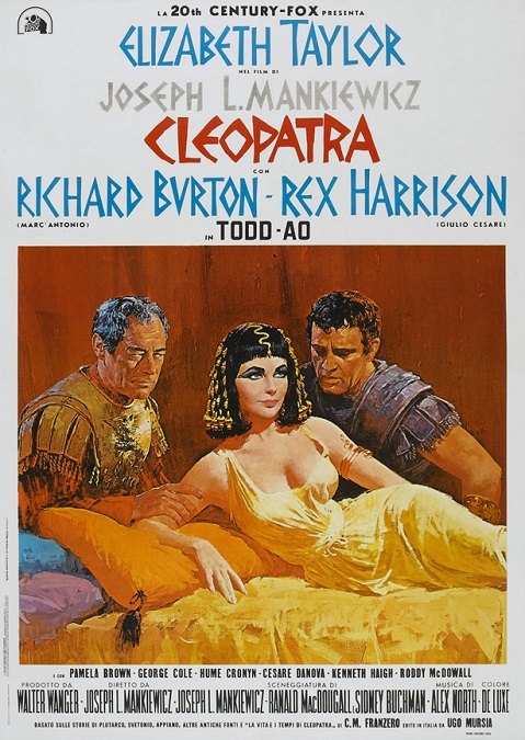
Cleopatra – 1963 (WINNER)

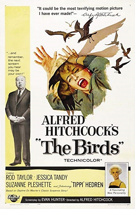
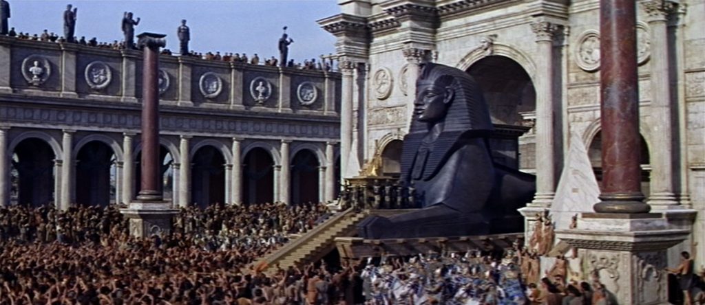
Sometimes it seems as if the academy voters are confusing production design with visual effects.  Cleopatra didn’t seem to do anything innovative or creative, especially when compared to its competition, Alfred Hitchcock’s The Birds.  This epic had some stunning visuals, but that was mostly due to the set and prop design, and the beautiful but terribly ridiculous costume design.  In that regard, it beat Hitchcock, hands down.  But its compositing, its blue-screen effects, its scale models, its matte paintings, its battles, and yes, even its grandeur were all old hat.

Now, that being said, once again, I’ll concede that the blue-screening very good.  It continued to improve as the technique was perfected.  The dark lines around the actors are pretty much gone by this point, making the illusion pretty seamless.  Also, they seemed to be getting better at matching the lighting between the actors and the backgrounds, making them appear to actually be in the different environments.  That’s not to say it was perfect.  There were a few shots that literally stood out, making the two images appear to be separate.  But for the most part, they were pretty good.

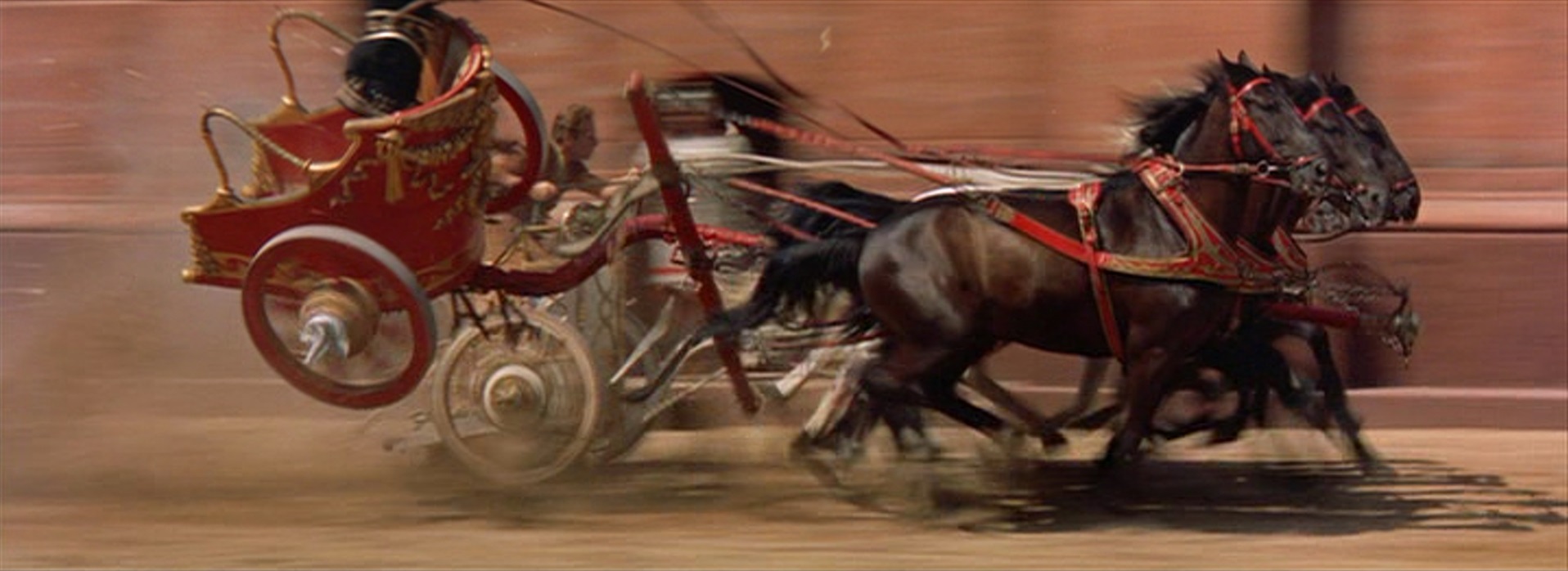
But as for the spectacle, it was pretty… well, spectacular.  There was a grandness that, at times, matched other pseudo-historical dramas like Ben-Hur and The Ten Commandments.  It was all part of that MGM formula for film success.  Make everything big and make it all epic.  Spare no expense in the sets and costumes.  Make everything out to be larger than life, including the acting, and you’ll have a successful film.  And darn if it didn’t work.

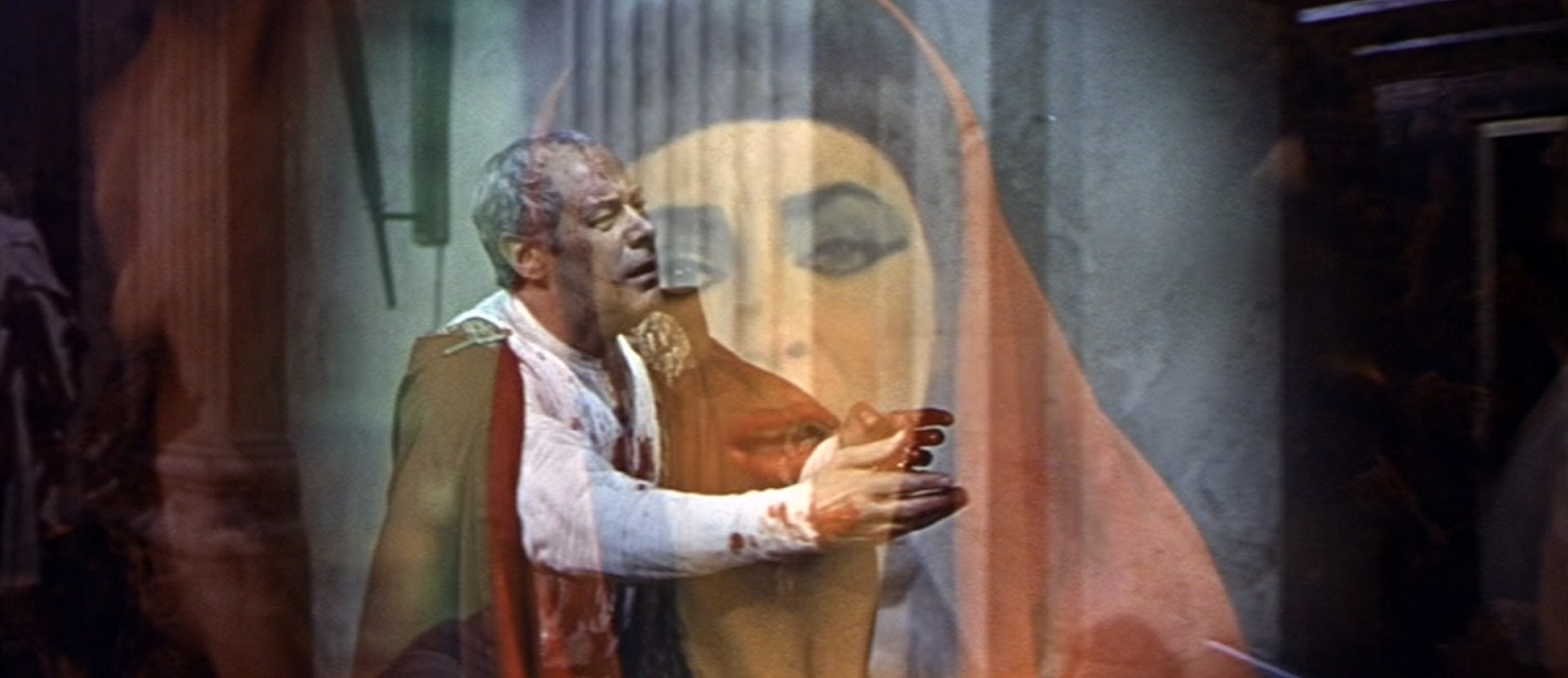
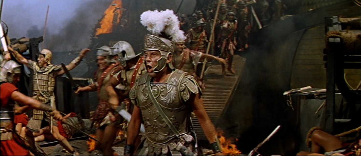
There were a few visual effects that were noteworthy, though nothing new or overly inventive.  The burning of the Library of Alexandria was nice, and was followed by a short battle sequence that displayed the Roman Turtle tactic.  But again, I would credit that to production design, not visual effects.  The fires were good, but ultimately unimpressive.  There was some mildly creative use of overlapping images during the scene where Cesar was assassinated, but those are directorial decisions, not special effects.

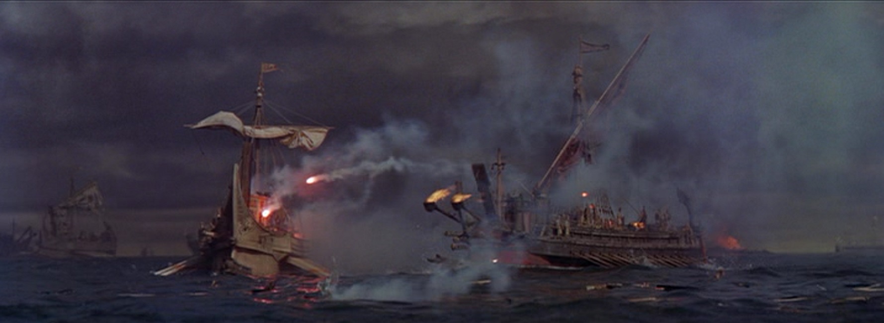
And then there was the naval battle.  There were a few good shots of the ships using catapults to hurl flaming projectiles at each other, and as the fighting came to a close, there were a few burning ships sinking into the water.  But again, it was nothing to write home about.  Just look at some of the previous films nominated for Best Special Effects.  The Sea Wolf, The Black Swan, That Hamilton Woman, and Ben-Hur all had comparable, if not better, battles at sea.

But Cleopatra took home the Oscar, so I must be missing something.  I even spent several hours doing research on the internet, trying to find the reason for this win.  However, every article I read either focused on the Elizabeth Taylor/Richard Burton affaire, or the film’s skyrocketing budget, neither of which is a special effect.

1963 – The Birds

The Birds – 1963

This was one of those movies that I have not seen in a long time, but I remember enjoying it. Not only did it have an interesting story, but it also had a bit of action, a thin but palatable romance, and some pretty unique special effects. Never before have I seen so many blue-screened birds seamlessly composited together on the screen at the same time. Of course, there were are few times when the blue-screening effects looked a little obvious, but most of the time, the birds were flying around so fast that the eye didn’t have time to focus on those minor flaws.

The plot was about the coastal town of Bodega Bay that is plagued by great flocks of birds that begin attacking and killing humans.  Just as a side note, I love that the movie never explains why. Hitchcock used a combination of live animals, puppets, and animatronic birds to create the illusion of killer swarms of seagulls, crows, and sparrows. There isn’t an academy award for animal handlers or trainers, but I think that maybe they should be included in the special effects category.

In the scene where they attack children at a birthday party, there were several examples of animatronic birds as they were attached to the kids’ necks and shoulders. You could see the wings flapping mechanically, or beaks pecking repetitively. But then, through the use of a couple of quick cuts, live birds replaced the puppets before being batted away by adults. The transitions were smooth and well-done. But it had to be more than that because there were shots of gulls swooping in and landing on the children.

Hitchcock was an incredible director. One of the things he did in this film reminded me of one of the most highly praised scenes of his career, the shower scene from his 1960 movie, Psycho. He flashed a confused series of images in quick succession, implying a lot of motion. It is a very jarring and chaotic technique that doesn’t actually put the actor in the middle of a maelstrom, though they very much seem to be. So Tippy Hedren is alone in a room and is attacked by dozens of birds. There is actually very little movement in the individual images that flash across the screen. Her head turns here. Her ankle is bitten there, a scratch appears on her cheek here, her hand is bitten there. But watch the individual images.  Some of them are almost still shots.  It was so innovative! So masterfully done!

But birds attacking people were not the only effects in the film. There was a dead man with his eyes pecked out, a really great action sequence in which a mass of seagulls attack the townsfolk, a gasoline fire, and a man being burned to death. And then there was the film’s final chilling scene in which the birds have trapped our protagonists in a house.  They have to make their way to a car through hundreds of birds that could resume their attack at any time. Just getting that many live birds to cover the ground, the roof, and every other available surface must have been a challenge in itself.  But it all looked real enough.  I say, well done, Mr. Hitchcock! Thanks for giving us something we had never seen before!

1962 – Mutiny on the Bounty

Mutiny on the Bounty – 1962

I have two things to say about the special effects for this movie.  First is that they were very good in a number of ways.  Second is that they were not as good as they thought they were.  Nothing says that both of those statements cannot be true.  And to be sure, there were a lot of special effects on which to comment.  But the movie had a sense of self-importance that I cannot get out of my head.  The film seemed to think it was the best movie ever made, and while it was indeed good, It wasn’t flawless.

The bad effects were few, so I’ll cover them quickly, and then go on to the good ones.  I didn’t care for the quality of a few of the blue-screen shots.  Some of them looked really obvious.  A few of the scale models looked a little too fake.  And lastly, there was, for the most part, nothing new or innovative about the visuals.  But that was about it.  Still, even those things were never really terrible.

There were two big scenes when it came to the movie’s money shots.  There was the storm that threatened to sink the ship when they tried to go around Cape Horn, and the second was the fire that destroyed the Bounty at the movie’s climax.  They were both incredibly intense, and the effects artists really earned their paychecks.

The storm was utterly relentless.  The close-up shots of the actors on the deck of the ship were full of slanted floors, spraying water, wind, rain, and an out of control barrel crashing around the hold.  There were men up in the ship’s rigging who were holding on to the ropes for their lives.  Then there were the wide shots where a miniature model was being mercilessly tossed around in the water.  The violence of the storm was so great that it looked as though the boat would surely be blown on its side.  There were also a few really great shots of waves that appeared as big as the merchant vessel, itself.

The fire at the end of the film was pretty spectacular.  There were actors that had to run amidst the flames, and while many of those dangerous-looking shots were clearly composited, not all of them were.  There were great fires below the deck and above it.  There were some really cool shots of the sails burning on the masts.

Other than that there was a gruesome scene where a man is taking twenty-four lashes with a flail, and another where a poor sailor is keel-hauled.  And there was another great blue-screened shot where a man falls from the rigging onto the deck.  They must have filmed that stuntman falling onto a giant blue air mat.  I have to mention that while some of the blue-screened shots were not perfect, overall, they were better in this movie than they were in most other films that came before it.  Obviously, filmmakers were continuing to perfect the effect technique.  But too bad for Mutiny on the Bounty.  It was up against The Longest Day. tentStyles

1962 – The Longest Day (WINNER)

The Longest Day – 1962 (WINNER)

I have to say, right off the bat, that this is one of the best war films ever made.  The historical accuracy, the drama, the casting, the acting, the directing, the cinematography, and yes, the special effects, were all top notch.  Of course, there was nothing new in the explosions or the gunfire.  So why would I call this a five-star Oscar winner?  For me, it was the sheer volume of the effects.  That might not sound like a great reason for my praise of the film’s achievements, but I’ll explain.

A single explosion is common, unimpressive.  If you have ten, they are a little harder to coordinate.  But when you have hundreds, as this film did, it would be a massive logistical undertaking.  Likewise, a single battle sequence in a movie might be the film’s focal point, or maybe its climax.  But The Longest Day had one complex battle sequence after another.  The complete chaos of the machinegun fire, exploding shells, smoke, sand, and screams all had to be specifically choreographed, and they did a fantastic job from beginning to end.

The movie was just over three hours long, and the phenomenal battles began around the half-way mark.  The rest of the film was almost constant scenes of horrific and heroic war.  It was nearly sensory overload.  Fortunately, the intense battle sequences were punctuated with important dramatic scenes that were kept brief and to the point.  The combination of drama and action was perfectly balanced to keep me on the edge of my seat, making the run-time of the film go by quickly.

Of course, the film was about June 6, 1944, D-day, and I think that one thing many people, myself included, sometimes tend to forget is that the beach assaults were not the only parts of the Allied invasion of France.  There were many different facets to the overall plan, and they were each supposed to work in tandem with each other to achieve victory.  The film covered most of them, and they each had their own unique elements which directed what visual effects would be required.

For example, in the fields inland from the beaches, there were paratroopers who were shot down as they descended to the ground.  Their objective was to derail a train  on a bridge over the Douve River.  At Pointe du Hoc, they needed to scale a cliff with grappling hooks, ropes, and ladders.  At Omaha Beach, there were two German airplanes that riddled the Allied soldiers with bullets.  At Sword Beach, there was a tank that was used to demolish a casino.  And, of course also on Omaha beach, there were explosives that blew a hole in the German defense wall, allowing American troops to escape the beach where they were being slaughtered.

Just the logistics of coordinating the entire film must have been a nightmare, and it was all spearheaded by producer, Darryl F. Zanuck and a team of different directors.  The visual effects artist who took home a well-deserved Oscar was Robert MacDonald, while the man behind the audio effects was Jacques Maumont.  They all deserve recognition because they really did a fantastic job!

1961 – The Guns of Navarone (WINNER)

The Guns of Navarone – 1961 (WINNER)

This was a really great movie, but I had to ask whether the special effects deserve the Oscar they won, or not.  And first my answer was:  Sure, I guess.  Why not?  It was up against Disney’s The Absent Minded Professor, and while this was, without a doubt, a better movie, the visual effects were no better or worse than its competitor.  And to be honest, I wanted a little something more from a winner.

The problem is that we’ve seen them all before.  So were they done better than other films?  Maybe.  I’m not saying the visual effects were done poorly.  On the contrary, they were done very well.  But come on Hollywood!  How many exploding scale models can we watch before they become just more exploding models, and is this what wins the award for Best Special Effects?  Where was the innovation?  Where was the creativity?  Where was the inventiveness?  Well, to give the movie proper credit, they were all there, though they were sometimes hard to spot.

The first really big effect we see is a storm that destroys a fishing boat and smashes it against the rocks.  Until that point, all we had were some matte-paintings, a few blue-screened backgrounds, a bit of gunfire, and an exploding ship that sinks beneath the waves.  Nothing new, right?  But the storm was wonderfully violent, and I applaud the effects artists for a job well-done.  The wind, the rain, the waves!  They even had the elements blurring the overall image on the screen, adding to the storm’s realism.  Then there was an interestingly shot sequence where the heroes had to do some rock-climbing up a sheer cliff in the rain.

After that there isn’t much, just a short sequence in which they are shot at by a couple of German planes, another in which a city is burned, and another in which a truck is set on fire and pushed into a ravine.  That is, until the film’s explosive climax, the actual guns of Navarone!  When they fired their massive shells, fire shot out of the giant barrels.  And then when they, and the citadel in which they were housed, was destroyed, the explosions were magnificent!  The scale models looked great as they were demolished and burned.  It was all very impressive, even though it was really nothing new. 

So where was that elusive inventiveness I mentioned?  What caught my attention was the improved use of the blue-screen, a technology which had not yet been perfected, though they made the effect as invisible as they could.  They blue-screened rain.  They had actors wear dark clothing to help hide the telltale black outlines that surrounded them.  They did a fantastic job of matching the lighting between the actors and the superimposed backgrounds.  There were only a few shots in which the actors didn’t really look like they were part of their surroundings.  But I suppose those imperfections were pretty easy to overlook.

1961 – The Absent Minded Professor

The Absent Minded Professor – 1961

At first, I was unimpressed with the special effects in this Disney movie.  Some of them looked incomplete, while others looked ridiculously simple.  But the more I think about the movie, the more I think I might have been mistaken.  So while the effects may have been silly, repetitive, and ultimately not worthy of an Oscar win, they were at least deserving of their nomination.  Let me explain.

The word of the day is flubber, a fictional substance that, when striking a surface, does not lose energy, but gains it.  Thus, when a flubber ball bounces, it continually bounces higher and higher. It allowed a car to fly, a basketball team to bounce over the heads of their opponents, and… well, really, that was about it.  All the effects in the movie were simply variants on those two things.

It is important to note that this movie was geared towards children, so silly and repetitive was what Disney wanted.  But that was one of the problems.  Not so much the silliness, but the way the same effect was used over and over again.  For example, the basketball scene was fun and amusing.  But later on in the movie, we see a man with flubber on the soles of his shoes bouncing over his dance partner’s head, just like the basketball players.  Later we see a man bouncing out of control in his front yard.  It was all the same effect, just dressed differently.  And the flying car effect was also treated the same way.  Here is the car flying at night.  Here it is flying above another car.  Here it is flying over Washington D.C. 

That being said, I really had to get past my own prejudices over the childish nature of the film, and look at the effects based on their own merits.  When I saw the basketball players bouncing up to the ceiling, I had to wonder.  How did they do it?

My first notion was that they were all on wires, but a friend pointed out to me that if that was the case, they didn’t have the technology in the 1960s to digitally remove the wires from the final image.  Then I thought that they had to have blue-screened all the athletes, and then manually moved them within the frame of the picture.  But despite this being filmed in black and white, there were no telltale discolored outlines around the basketball players.  They were expertly composited into the scenes.  I could find nothing on the internet specifically saying how they achieved all the bouncing people, but I have come to believe that they were, in fact, suspended on wires.  They moved as if they were.  But I also found that while blue-screening was not used, they did use a similar technique called sodium vapor processing, which, in a black and white film, might virtually erase the discolored outlines around composited images.  The flying car was indeed on wires, suspended from a rectangular platform, which was lifted up by using a one hundred fifty foot crane, though I never saw a single wire.  Ok, Disney.  I am grudgingly impressed. 

1960 – The Time Machine (WINNER)

The Time Machine – 1960 (WINNER)

I really liked this movie.  The visuals were creative, fanciful, fun, and a feast for the eyes.  They gave audiences multiple images and effects that the world had never before seen.  But that isn’t to say they were all perfect.  They were not.  The film’s extraordinary production design helped to enhance the visuals, but there were too many times when I was taken out of the story because of sub-par special effects.

For example, the scene in which the volcanoes erupt and flow down the street of a city.  While it was a cool effect to watch, it was painfully obvious that the filmmakers were using scale models.  The cars looked too much like toys and the lava looked too much like viscous mud under a red lighting gel.  It looked bright and interesting, but completely fake.

Next, there was the matte painting of the landscape of the extreme future.  It was a painting that looked like a cross between the styles of Thomas Kinkade and Bob Ross.  Once again, it was beautiful, but it also looked entirely unreal.  This example stands out even more than the other, because we first see the fantasy terrain in oils, then we cut to a shot of our hero walking amongst real the foliage.  It was so different, it got me thinking about the inconsistency of the images, instead of being immersed in the story.

But fortunately, the film had more good special effects than bad.  One of the earliest effects in the narrative was when the character of H.G. Wells starts his journey forward through time.  I think they used a blend of two different effective techniques.  First was a form of stop motion or single image animation.  They had a fast stream of separate rear-projected images shown in such quick succession as to appear to be a quickly morphing moving picture.  The second was actual time lapse photography, showing the world around the machine moving at incredible speeds.  

I liked the way Wells observed a mannequin and her quickly evolving display of ladies fashions, and the way he could see the sun speeding past his skylight.  I liked the way the mountains rose up around him as he sped forward in time, only to crumble away as the rocks are worn down by the ravages of centuries.  The matte painting of the giant head atop Morlock temple looked ominous and forbidding.

I also really liked the burning of the Morlocks’ cave.  They actually set a stunt man on fire and kept him on the screen for several seconds before allowing him to rush through a doorway where, I’m sure, men were waiting with fire extinguishers.  But I think that the film’s best effect might have been the accelerated decaying of the dead Morlock body.  It looked incredibly complex and fairly realistic, and I was properly impressed.  In other words, despite the bad scale models and the painted landscapes, I think that this movie was a deserving Oscar winner!

1960 – The Last Voyage

1960 – The Last Voyage

Here we have a true disaster film, worthy to stand in the company of other great disaster films like The Towering Inferno, the Poseidon Adventure, and Airport 57.  And in light of that, the quality of the special effects didn’t disappoint.  So why didn’t I award them a five star rating?  Because the special effects just weren’t that visually interesting, and there weren’t as many of them as I would have liked.

The movie was about an old cruise ship that was going to be decommissioned.  Even before the opening credits started to appear on the screen, we are shown that there is a major fire in the boiler room.  The fire fuses the pressure valves to the boilers, and it isn’t long before the they explode, ripping a hole through the middle of the ship and breaching the hull.  But then most of the movie follows two things.  The first is the efforts of a man trying to save his wife who is trapped under the wreckage.  The second is the crew of the ship trying to convince the Captain to follow safety precautions.

In other words, there was more drama than action, and while there is nothing wrong with that, it didn’t leave a lot of room for visual effects.  That being said, the fiery explosions were pretty spectacular!  Also, the flooding of the engine room was pretty well-done.  At first they tried to shore up the bulkheads with wooden beams, but eventually the water started seeping through the walls.  The trickle became a spray, which eventually became a flood.

The part where the smoke stack cracks in half and falls on the captain’s office was cool.  The black billows of smoke that rose from the breach were realistic.  But we never actually see the Captain getting crushed.  We see the crash, and then when the First Mate investigates, we see the Captain’s head sticking out of the rubble just enough to allow him to have a dramatic death scene.

But unfortunately, the climactic ending was a bit anticlimactic.  During the whole sinking of the cruise ship, we are periodically shown some wide angle shots as the life boats flee.  The sinking ship remained mostly level in the water.  In the close-ups, rooms and decks were being submerged, but in the wide shots, the ship was level?  And only once, as the man, his rescued wife, and the crew members who helped them are running for their lives, do we see them on a slanting floor.

Then as they tryto escape the foundering vessel, the water is flowing over the deck faster thanthey can run.  It isn’t long before theyjust hop over the railing and swim to the life boats.  And finally, we are shown a black, indistinctshape submerging under the roiling waves. But for that, I must say, it was kind-of weak for the climax of anotherwise OK disaster film.  I don’tknow.  I guess I just expected a littlemore from what could have been a visually stunning movie.

1959 – Journey to the Center of the Earth

Journey to the Center of the Earth – 1959

I’m conflicted when it comes to assessing the special effects on this film.  On the one hand, they were wonderful.  They were unique, innovative, artistic, and at times, beautiful to see on the screen.  But on the other hand, they were obvious.  The gorgeous matte paintings looked too much like paintings.  Some of the forced perspective and compositing didn’t quite look natural.

Fortunately, this wasn’t the movie’s fault.  It was the technology of the times.  This was the best they could do.  Knowing that, it is easy to forgive the minor imperfections, the dark blue-screening lines around the giant reptiles, the suddenly grainy picture quality when the lizards are shown close up, the ridiculously fake tongue of the giant salamander when it tries to eat James Mason. 

But those few problems paled in comparison to the awesome visual effects that dominated the film.  Like many Jules Vern adventure tales, this film had a slight steampunk aesthetic which I have always liked.  In that, some of the visual effects were nothing more than great set design and props.  And I was captivated by all the stunning environments in the movie, like the dusty salt caverns, the giant mushroom forest, and the lost city of Atlantis.  Though these could all easily fall under the purview of the Art Director, I’m sure the visual effects artists had a hand in creating those sets.  The set designer might have designed and built the fantastical crystal cave, but the special effects guys made them glow and sparkle.

Another memorable effect was the giant monsters.  Despite the obvious way the in-camera focus of the creatures shifted when the live animals were filmed at extremely close range, in order to force our eyes to perceive them as giants, they were really cool!  I’m so glad they chose not to use stop motion animation or worse yet, massive, clunky animatronics to achieve the effect.  I also loved the whole scene where they make it to the exact center of the Earth.  They are on a raft in the middle of a subterranean ocean.  Powerful magnetic forces rip all the gold our heroes carry away from them.  There is a storm, and a giant whirlpool that seizes the raft.  It was a fun scene to watch!

And I can’t forget the movie’s exciting climax!  The adventurers find a shaft that leads from Atlantis to the open sky.  Their plan to return to the surface is to use gun powder to blow up a rocky obstruction, and ride a powerful updraft of wind to the open air.  Instead they cause an earthquake which destroys the lost city, and a volcanic eruption.  Lying in a giant asbestos altar stone, they ride the rush of lava up the volcanic shaft to freedom.  Never-mind the fact that the trip would have taken hours if not days, during which time, the people would have been cooked like eggs in a skillet.  Who cares?  It was still a lot of fun to watch!

1959 – Ben Hur (WINNER)

Ben-Hur –1959 (WINNER)

Ben-Hur was a behemoth of great special effects.  There were phenomenal stunts, detailed scale models, absolutely first-rate rear-projection, masterful matte-paintings, incredible sound and sound mixing, fires, a naval battle, an exciting chariot race that lasted nearly ten whole minutes, and vivid, striking imagery that was a feast for the eyes!  How’s that for a single movie?

Of course when people think of this film, the first thing that usually comes to their minds is the afore-mentioned chariot race, so I’ll start there.  It was, even by today’s standards flawlessly done.  Once the flags were lowered, the intensity went from zero to a hundred in an instant.  The pace was fast and relentless, never slowing even for an instant.  The wide shots made use of matte paintings composited with live action so seamlessly, it looked completely real.  When the camera focused on the actors’ faces, the rear projected backgrounds were perfect.  The actors looked like they were actually part of the projected images. 

And the stunts!  When a chariot was destroyed, broken, or flipped, the drivers were tossed about like rag-dolls.  There was one great shot when the Charlton Heston’s stunt man was flipped over the front of his chariot, and then we saw Heston climbing back into the vehicle.  The shot where his nemesis Messala, played by Stephen Boyd, crashes and is trampled by a team of horses, dragged behind his speeding steeds, trampled some more, then crushed under chariot wheels.  They used a dummy, of course, but the transition from man to dummy was nearly undetectable.  The whole race was memorable for a good reason.

But there was so much more in the film.  The naval battle was just as exciting and visually stunning.  But there were three other images that stand out in my mind, and really caught my attention, all of which were religious in nature, which makes sense, as the film is, after all, a biblical epic.  In the beginning, the image of the star of Bethlehem moving through the sky and shining its light down on the stable was beautifully done.  The dark and sleeping town looked perfect.

The other are two separate images at Christ’s crucifixion.  Director William Wyler chose to never show us Jesus’s face.  But there is a powerful shot of Christ hanging on the cross, shown from behind, against a dark and raining sky.  The other is an up-side-down image of him reflected in a bloody puddle of water, shown only for an instant before the rain obscures the reflection.  The artful effects really turned the sequence from just emotional to devastating.  And the whole movie was full of similarly intense imagery.  Wyler and his special effects really knew what they were doing, and deserve all the Oscars they won.  And incidentally, I watched the chariot race from the 2016 remake.  It was nowhere near as good as the 1959 version.