1956 – Forbidden Planet

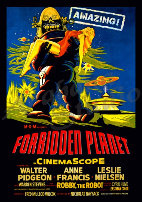
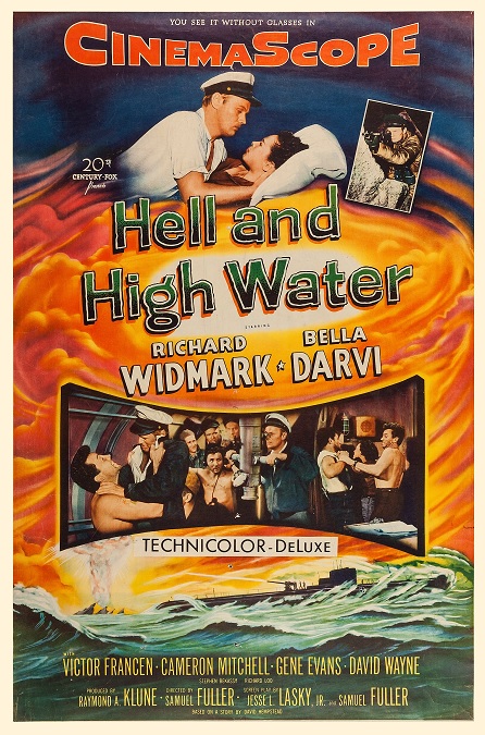
Forbidden Planet – 1956

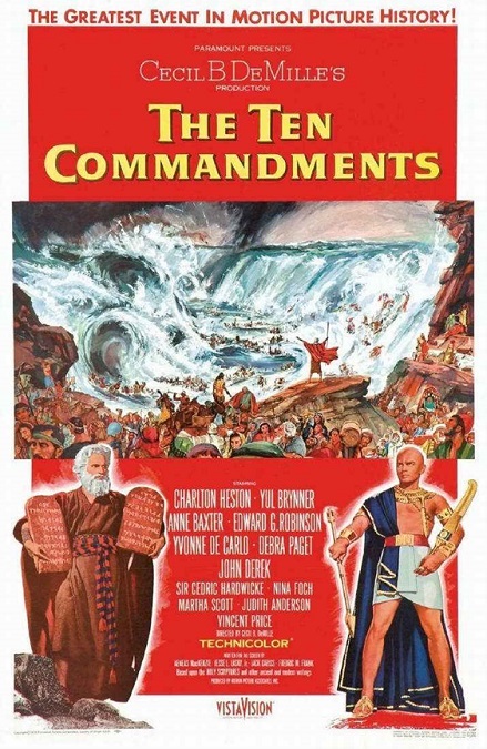
Wow!  Another great movie for the Special Effects category in 1956!  These effects were creative, inventive, and integral to the telling of the  story.  The were big, colorful, and visually dazzling.  In other words, they were everything that the category embodies, and it really deserved its Oscar nomination.  But the reason it didn’t take home its statue is that it was up against The Ten Commandments.  Kind of hard to beat that one.

This was a true science fiction fantasy film.  The story takes place in the far future, where mankind is seeding the galaxy with colonies.  Space travel is common, and there is also a interstellar military organization that maintains and polices the settlements.  The concept sounds vaguely familiar, right?  Well, it should.  Gene Roddenberry, creator of Star Trek, has said that Forbidden Planet was one of his inspirations when developing his famous franchise.

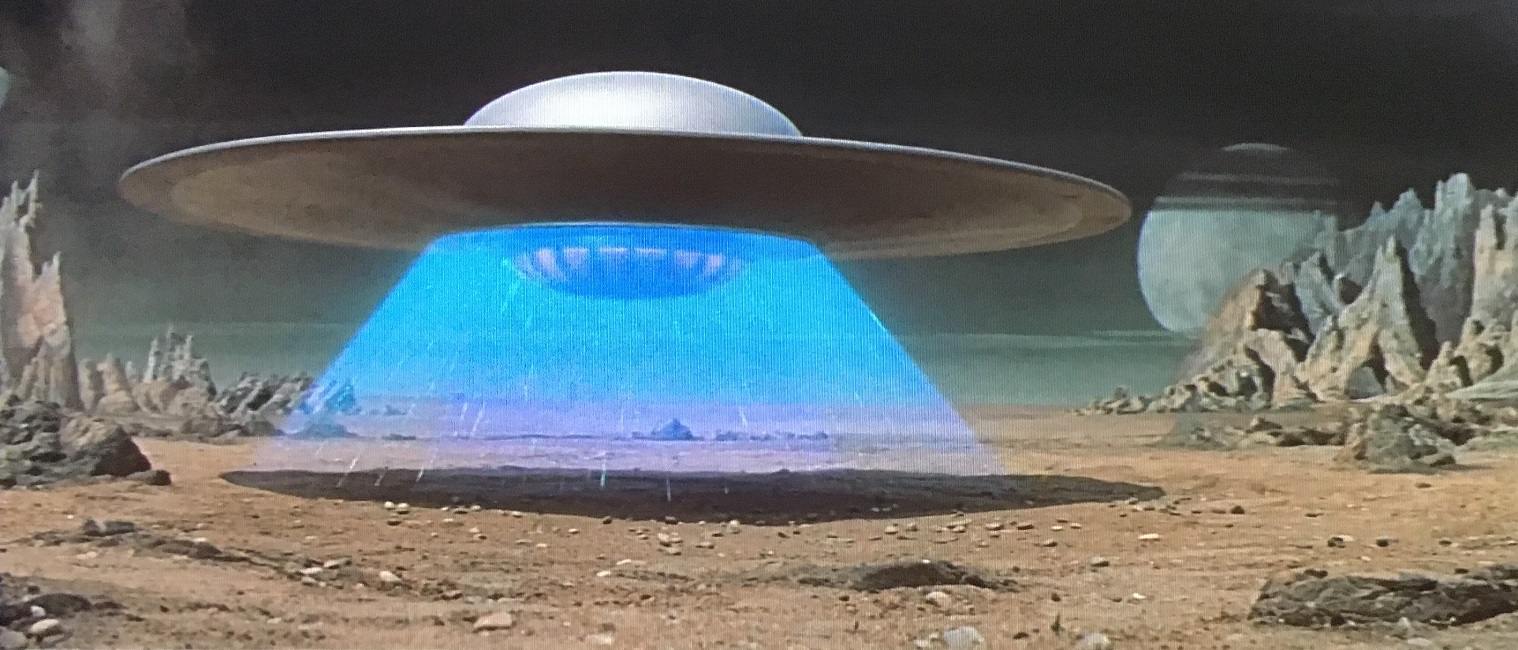
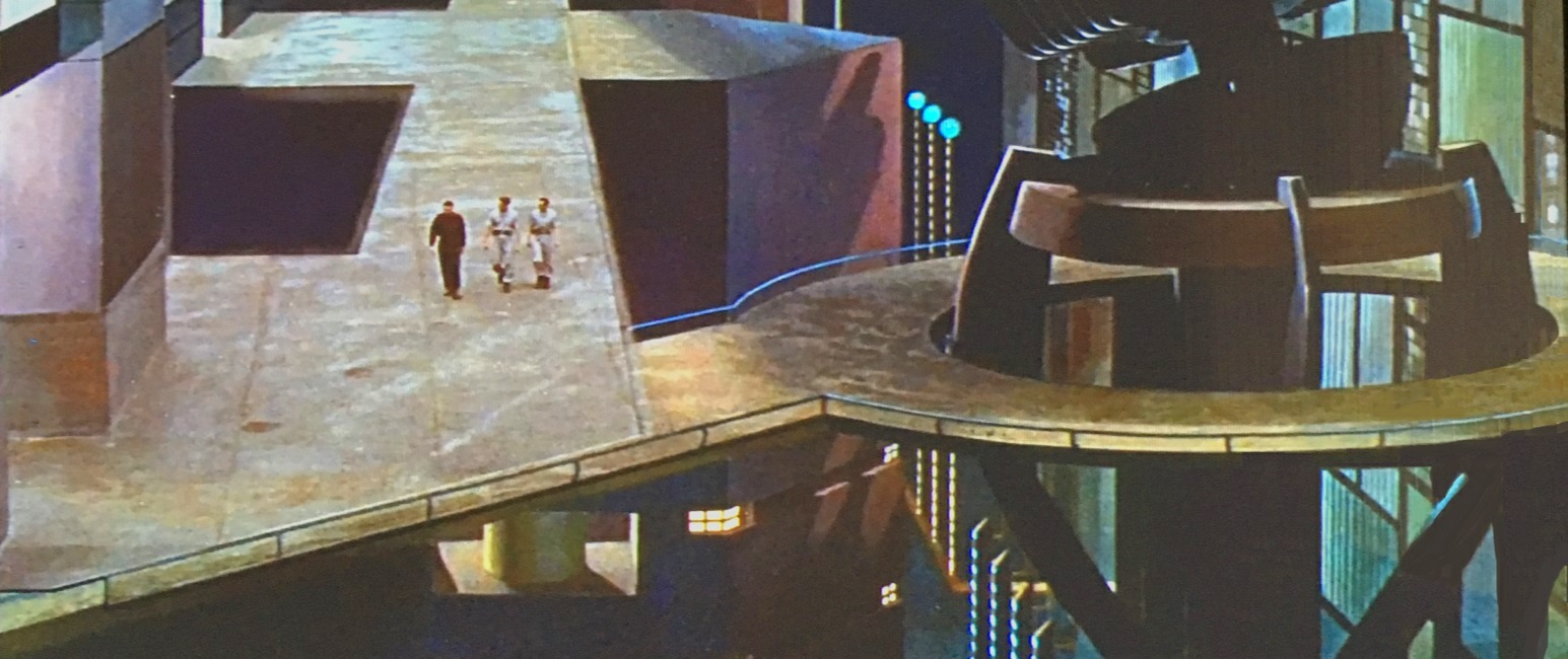
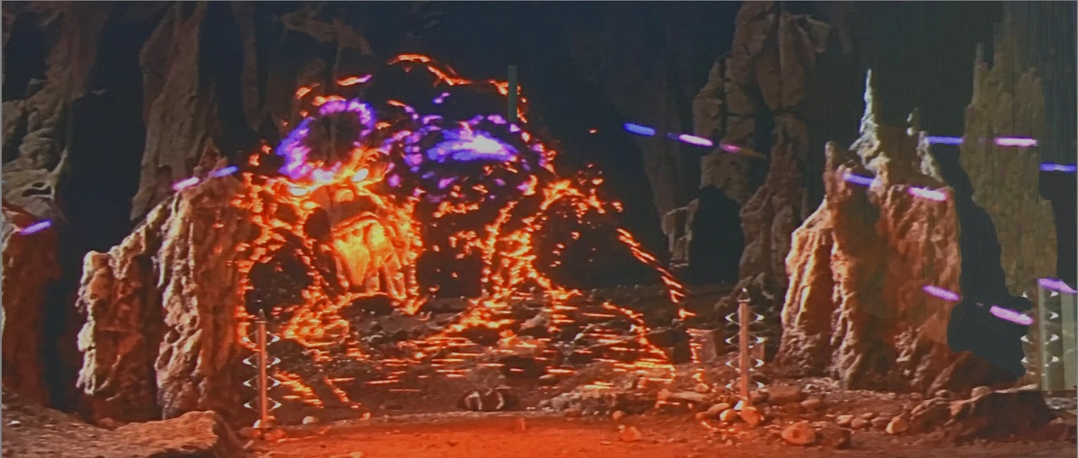
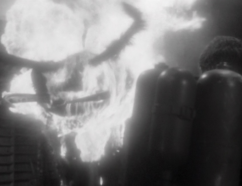
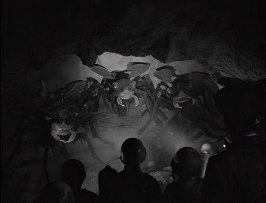
The only other two space fiction films that had been previously nominated for Best Special Effects were Destination Moon in 1950 and When Worlds Collide in 1951.  The fantastic visuals included things like a great shot of the flying saucer cruising around the dark side of a planet, causing a spectacular eclipse, the matte-painted alien landscape, ray-guns with electric purple beams, a massively gigantic underground complex, and an invisible monster that is made visible in a fiery ghost-like outline.  And all this was wrapped up in a fantastic and well-developed script that went a long way to light up my imagination and enhance the realism of the plot’s fantasy.

The fiery ID monster was one of the coolest effects in the film.  I originally thought it was simply impressive hand-drawn animation, but my research turned up something a bit more complicated.  According to Wikipedia, the special effects artist, Joshua Meador, an animator on loan from Disney, “sketched each frame of the entire sequence in black pencil on white paper; each page was then photographed in high contrast, so that only the major details remained visible. These images were then photographically reversed into negative and the resulting white line images were then tinted red, creating the effect of the Id Monster’s body remaining largely invisible, with only its major outlines illuminated by the energy from the force-field and blaster beams.”

And I have to mention the infamous Robby the Robot.  This was the film that created the iconic machine that was used over and over again in movies and television, from The Twilight Zone to Lost in Space.  The robot effect cost about $125,000 to build, but has since become the most expensive movie prop ever to be auctioned, going for a price of $5.3 million.  Even in the mid-50s, he looked great!

1956 – The Ten Commandments (WINNER)

The Ten Commandments – 1956 (WINNER)

The Ten Commandments was a tour de force of amazing special effects.  This movie gave audiences things they had never seen before and some of them hole up pretty well, even by today’s standards.  Granted, not all the visual effects were perfect.  After all, this movie came out in 1956.  There was no CGI, so everything was done with practical effects.  But despite some obvious imperfections, that was the very thing that made the effects so utterly amazing!

The visual effects’ biggest failings was really only two things.  First was some of the blue screening effects.  There were several scenes in which it was a problem, but the one that sticks out in my mind was when Moses is showing the Pharaoh the building of the city of Goshen.  There are actual black lines surrounding the actors when they are looking out over the balcony.  There is also a black line outlining the giant statue being moved below them. My second complaint is the scene where the staffs are turned into snakes.  That effect looked pretty bad, especially compared to the awesome effects in the rest of the film.

There was the burning bush, the turning of the river into blood, the burning hailstones falling from the sky, the angel of death, the pillar of fire, the parting of the Red Sea, the hand of God burning the words of the Ten Commandments onto the stone tablets, the destruction of the golden calf.  All that, and the scale of the visuals were phenomenal, enhanced by perfect matte paintings.

There were so many scenes in which the film’s director, Cecil B. DeMille, clearly spared no expense to create his grand vision of the Biblical epic, from the gigantic sets to the  fourteen thousand extras, from the grand score by Elmer Bernstein to the elaborate and opulent costumes by Edith Head.  Everything was done on a massive scale and it all combined to make some pretty unforgettable visuals.

But the movie’s biggest draw, its most memorable special effect, was the parting of the Red Sea.  To quote Wikipedia, “The parting of the Red Sea was considered the most difficult special effect ever performed up to that time.  This effect took about six months of VistaVision filming, and combined scenes shot on the shores of the Red Sea in Egypt, with scenes filmed at Paramount Studios in Hollywood.”  It really is very impressive, compositing so many screen elements to make the effect look as fantastic as possible.  Pure magic!

But for my money, the creation of the stone tablets of the Ten Commandments was just as impressive and just as memorable.  Sure, the pillar of fire was clearly hand animated, as it had been earlier when it had defended the Israelites from Pharaoh’s armies, but for 1956, it was a spectacular visual effect.  DeMille really blew the competition away with this cinematic masterpiece!

1955 – The Rains of Ranchipur

The Rains of Ranchipur – 1955
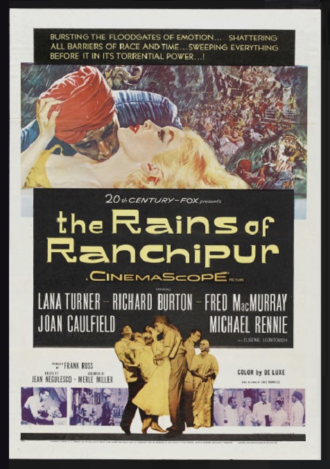
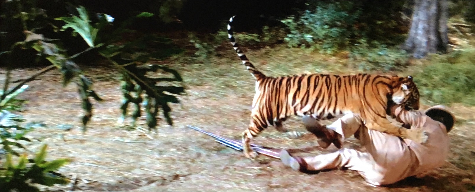
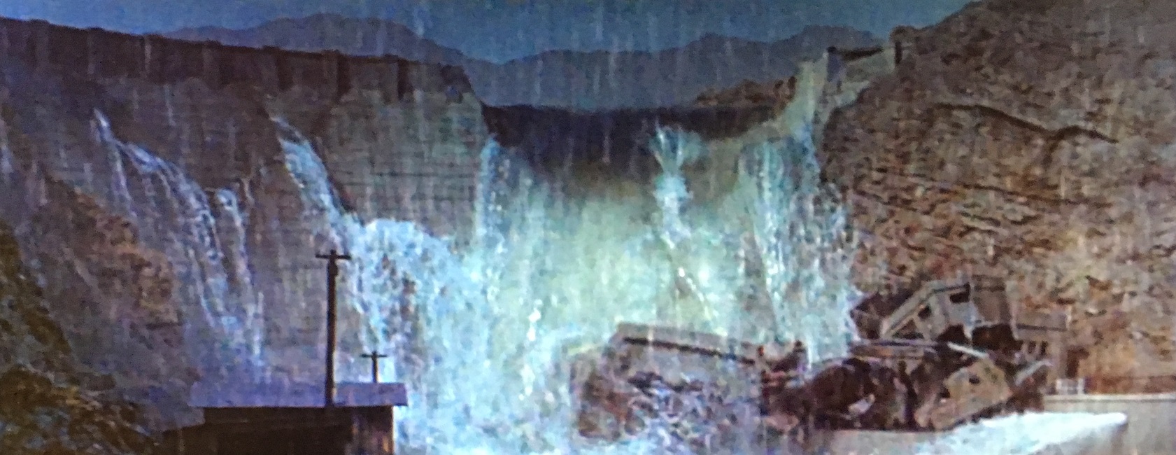
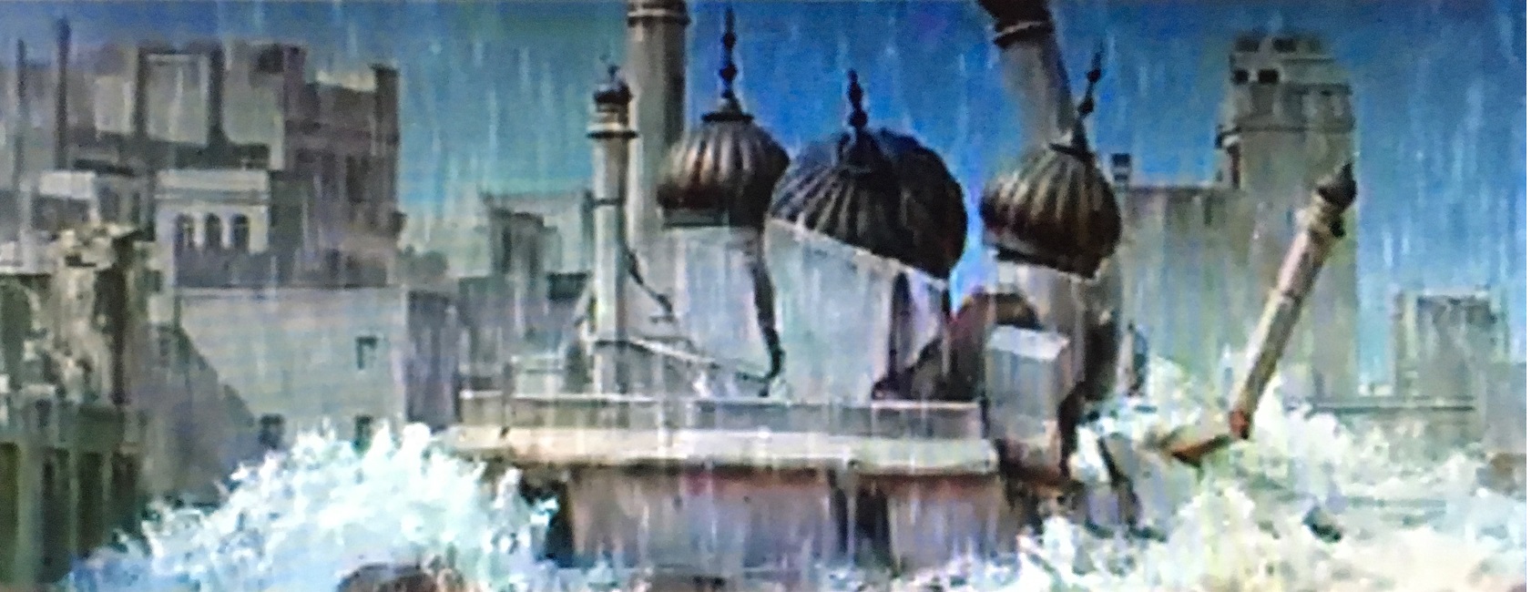
This movie was a remake of the 1939 Best Special Effects winner, The Rains Came.  There were very few significant changes to the story line, and the visual effects covered the exact same natural disaster.  But this time it was all in Technicolor.  The only real addition was a short and quick tiger attack, and a toppling palace.  So why did I give this film only three stars when its predecessor had five?

Well, The Rains Came was made a decade-and-a-half earlier.  By the mid-50s, they should have perfected some of these techniques, and there were certain shots that looked shoddy.  For example, in this movie, there is a small conversation that takes place between our two romantic leads, Richard Burton and Lana Turner.  They are walking towards the camera as they talk, but the rear-projected background looked horrible.  It appeared not only out of focus, as might be expected, but it was grainy as well, as if I was seeing just the background through a dirty window.  Meanwhile, the actors were perfectly clear and in focus.

Another problem I had was the flood sequence.  Most of it was pretty spectacular.  The breaking of the dam was pretty impressive, though the strange looking water gave away the fact that it was a scale model.  But never-mind that.  What bothered me were the shots where great bouts of water crashed over the screaming people, sweeping them all away.  In a few of the shots, the people seemed to disappear before the water had completely covered them.  It just looked a little off.

But everything else was actually pretty impressive.  There was the massive earthquake that opened up fissures in the ground which swallowed the screaming crowds.  Buildings were crumbling left and right, and the heavy rain never stopped.  The destruction of the palace with the onion domes was very cool.  There was also an awesome dynamite explosion set off to clear heavy debris from a clogged water-way, allowing the water lever in the city to recede.  The movie had no shortage of Special effects, and while many of them were quite good, a few of them were not.

And lastly, I need to mention the sound.  On Wikipedia’s list of Special Effects nominees, from 1949 to 1956, specific names of effects artists are not given, only the names of production studios.  Then from 1957 to 1962, specific artist for either visual or audible effects are given.  Then in 1963, Visual Effects became its own category, separate from sound effects.  I only mention all this because the sound in this movie was off, not in the action sequences, but in the regular dialogue.  The sound quality often changed dramatically, depending on the camera angle in a single scene.  From one angle, they sounded like they were talking in a small room, while from another they sounded like they were talking in a large hall with high ceilings.  I expect better from an Oscar nominee.

1955 – The Dam Busters

The Dam Busters – 1955

This WWII movie that follows the development and creation of a specialized weapon that was used by the Allies to destroy dams, was a good film that had some pretty impressive special effects.  Unfortunately, in my opinion, they were not impressive enough to earn a full five stars.  They had a lot of good ideas that just fell a little short in terms of execution.  Here’s why.

First of all, it is important to note that they decided to shoot the movie in black and white, in an era where making color films was common enough, and they did it for a very specific reason.  When the weapon, known as the bouncing bomb, was being tested, they filmed the tests, and that B&W footage was easily incorporated into the movie.  To their credit, I would have never suspected that it was actual news-real style footage, so I’d say it was a wise decision.

But I think the real reason this movie’s visual effects didn’t take home the Oscar was that when they were good, they were fantastic, but when they were bad, they were pretty darn awful.  Unfortunately, the worst effect in the film was the money shot, the climax of the film, where you would expect the effects to be the best the filmmakers could produce.  But not so.

When the bombs exploded, they composited images of the exploding water spouts into the miniature dam sets that were constructed.   But the edges of the eruptions were clearly visible, surrounded by thick dark lines.  The events took place at night, and they did a fair job using the day-for-night technique, so everything could be seen.  But that was the problem.  I could see everything, including the edges of the cut-out explosions.  This had the disadvantage of making what was supposed to be a massive explosion look very contained, and pretty fake.

But I must say that was very impressed with their miniature model work.  Based on the airplane’s high in the sky perspective, I would never have guessed that the dams that were being destroyed were actually miniatures.  The countryside that surrounded them was detailed and completely convincing as authentic.  There was a great shot of an airplane, another miniature, that was shot by enemy fire, burst into flames, and crashed to the ground that was incredibly well-done.  And the great rear-projection shots were also pretty impressive.

Another effect that was a pleasant surprise was the animated gunfire.  As the airplanes made their bombing runs, they are set upon by barrages of enemy machine-gun assaults.  The little streaks of flying light were obviously animated, but they did their job well enough.  And lest I forget, the precision stunt-flying was noteworthy as well.  While the planes were supposed to be flying at 60 feet, they actually had to go to 30 feet to make it look low enough on film.

1955 – The Bridges at Toko-Ri (WINNER)

The Bridges at Toko-Ri – 1955 (WINNER)

This movie had a lot of special effects on display.  There were a number of stunts and some impressive precision flying, and it has been a while since we’ve had a Best Special Effects nominee that made use of that.  Then there were a few crash landings that looked pretty difficult, one on the surface of the ocean, another on the deck of an aircraft carrier, and a third that was a forced landing in an open field.

The water landing was pretty cool.  Lieutenant Brubaker, played by William Holden, has to ditch his jet fighter, but he is then stranded in the freezing water.  When the rescue helicopter, piloted by CPO Mike Forney, played by Mickey Rooney, shows up to air-lift him to safety, we get to see the real thing!  There were no scale models used here.  All the helicopters, the fighter jets, and the aircraft carriers were all the real deal.  Whenever the fighter jets landed on the carrier runway, it looked pretty dangerous.  Hats off to the skilled pilots who made it look easy!

It is important to mention that this was the first visual effects nominated film that dealt with the Korean war.  Now, while it is true that jet fighter planes were first used in the last two years of WWII, this is the first film I have seen which made use of them.  In fact, the movie starts off with a special thanks to the United States Navy, and the men of the Naval Air and Surface Forces of the Pacific Fleet, for making the film possible.

As far as the special effects went, the film really had two climaxes, and it was the first of them that was the movie’s real money sequence.  Our fearless fighter pilots are sent on a near-suicidal mission to destroy three bridges.  The area is heavily guarded and the jets have to speed through a canyon while avoiding the massive barrage of enemy fire.  There are smoking rockets, bullets, and anti-aircraft projectiles being launched at the twelve jets from every side.  The sheer chaos of the sequence was very well choreographed.  And then there were the fantastic destructions of the bridges.  It was an exciting sequence to watch!

The movie’s second climax was a scene in which most of the characters we have spent the last hour and a half getting to know and like are killed off.  Lieutenant Brubaker crash lands in enemy controlled territory.  The remaining jets stay as long as they are able to protect him from the approaching enemy soldiers.  Then a rescue helicopter arrives, but it is shot down.  The co-pilot is quickly riddled with enemy bullets.  Brubaker and Forney get pinned down in a ditch, and are eventually overrun and killed by Korean soldiers.

It was a pretty exciting and tragic end to the movie, and the special effects team really gave us some great visuals to watch.  And cheers to the film’s director, Mark Robson, for putting it all together in such an exciting way.

1954 – Hell and High Water

Hell and High Water – 1954

The visual effects for this movie were, honestly, a little disappointing.  Most of them were just fine, but not all of them.  There were a few obvious flaws, things that I’ve seen some of their contemporaries do better. It just doesn’t seem like the filmmakers really stretched themselves.  These were all effects that we’ve seen before.  There were diving submarines, fuel explosions, gunfire, and torpedoes.  There were a few interesting visuals, but for the most part, they seemed to be standard run-of-the-mill effects.

What I liked were the underwater submarines.  Clearly, these shots were accomplished using miniature models, but they seemed to be perfectly detailed.  There were two different models that were both, according to the plot, of Japanese origin, but they looked distinctly different so the audience could tell them apart.  The scene where the good guys rammed the bow of their enemies was pretty cool.  They punched a massive hole in the hull that gushed black smoky clouds.  The underwater sequences were always murky and dim, which was appropriate, but some of this action was a little difficult to see properly.

And there were several scenes that took place above the surface of the water, in which the actors were performing in front of a blue-screen.  You could tell, because you could still see a little outline of discoloration around the actors and the sets.  The effect wasn’t great, but it wasn’t terrible.  I’ve seen worse.  The same could be said of some of the explosions that took place on land.  The actors and sets in the fore-ground didn’t seem to belong to the backgrounds.  But then there were several shots of men running between patches of real fire.  As for the fire effects, there was one shot, in particular, that showed burning liquid fuel flowing down the side of an embankment, and that was pretty cool.

An effect I didn’t particularly care for was when the exterior shots of the sub under the water specifically showed it to be lying at an angle, for example, on the ocean floor.  They would then cut to an interior shot, and the camera was tilted, but the actors were either kneeling or standing on a set that was clearly upright and level.  When the sub was being rocked back and forth.  They showed the heroine lying on her clearly stable bed, rolling back and forth.  It was obvious and a little cheesy.

And finally, there was the nuclear explosion that was shown both at the beginning of the film, and at the end.  It looked incredibly realistic.  No wonder, because my research told me that it was actually real.  The explosion footage was obtained from the U.S. government, with one condition.  The filmmakers were instructed to eliminate certain spectrum colors from the shots.  Apparently, there was a concern that not doing so “could reveal nuclear secrets.”  Who knew?

1954 – Them

Them – 1954

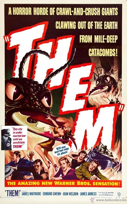
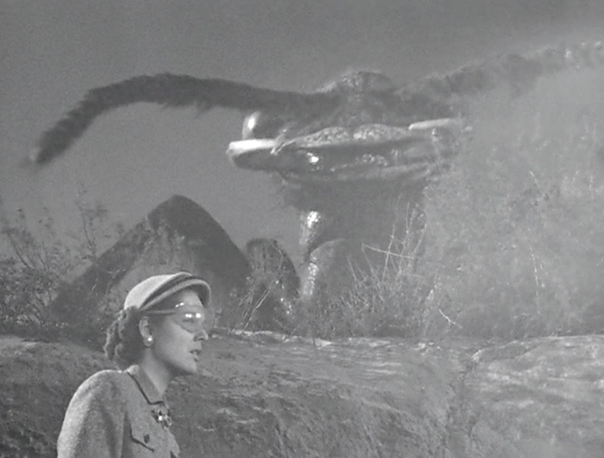
I don’t understand what was so special about the special effects for this movie.  They used some very big animatronics, and that was their big draw, but I wasn’t impressed.  The giant ants looked fake, moved slowly, and appeared to be very clunky.  And I’m not just saying that based on today’s standards.  This movie looked like it could have easily come out in the 1930s.

So why was it nominated for Best Special Effects?  I’m not sure.  So I did my research, but unfortunately, I couldn’t find much.  The main thing were the giant ants.  After doing a bit of reading, I found that my suspicions were correct.  There was a reason we never saw more than three of them on the screen at the same time.  Only three animatronic ants were constructed.

But that wasn’t the problem.  I doubt there would have been enough room to have any more on the screen at the same time.  But they kept talking about how there might be thousands of them, and if it was in any way intended to be realistic, there would have been. Power in the insect kingdom has a lot to do with numbers, and I never got the sense that there were that many of the creatures.  Had it been a real ant colony, the humans would have been swarmed.  They wouldn’t have stood a chance.  But I get it.  They were probably expensive, and budget was a concern.

In fact, the movie was originally intended to be quite different.  Per IMDB, “[The film] Was originally supposed to be filmed in color.  Two days before shooting began, a nervous studio cut the budget, and the film had to be made in black and white.  However, in the opening credits, the title is shown in bright red [and blue] against a black and white background.  It was also supposed to be in 3-D.  Some elements of the 3-D effects, such as the ants having extreme close-ups and the flame throwers shooting straight into the camera, were used in the film.”

And as for those flame throwers, they were actually pretty cool, but flame throwers always are.  There were even multiple shots of the ants getting set on fire while they were still moving.  And there was a cool scene where a B-25 Mitchell bomber shared some screen time with the ants, which was pretty neat.  And to be fair, the filmmakers did a pretty good job of building the tension in the first quarter of the movie, before the ants were ever even seen.  The menacing and otherworldly noise they made helped to increase the threat of the unseen creatures.

But when it comes down to it, the ants just weren’t impressive enough, and they were what we had all come to see.  They moved too slowly and there weren’t enough of them.  They looked too fake.  And as far as monster movies go, it just seems like earlier films did a better job.  But the movie did pretty well at the box office, and critics still praise it today, so really, what do I  know?

1954 – 20,000 Leagues Under the Sea (WINNER)

20,000 Leagues Under the Sea – 1954 (WINNER)

Here we have Disney finally throwing its hat into the ring, and their first venture was a good one.  I remember seeing this movie as a young child and being mesmerized by the wonderful underwater imagery, the glowing lights of the Nautilus as it prepared to sink a ship, and the battle with the giant squid.  It was a pretty magical piece of fantasy that Walt Disney brought to life to thrill audiences the world over.

It is significant to note that this was their first fully live-action film, and that it was the first science fiction movie ever shot in Cinemascope, which is a special kind of camera lens used for making widescreen movies.  It was also an early precursor to the steampunk aesthetic, which I have always loved, especially in the design of the infamous submarine and the diving suits.

From the first time we see the Nautilus on the screen, its glowing yellow-green windows that looked like the eyes of a sea-monster, captivated my imagination.  The vessel was designed by Harper Goff, and he really did a fantastic job.  It had the look and feel of a massive sea-creature, despite being made entirely of metal.

I happen to be a fan of practical effects, rather than animation. Here, the animation was kept to a bare minimum, and it gave the whole movie a realistic, tactile feel that I liked.  The animatronic effects of the film’s centerpiece, the giant squid, had a wonderful physicality about them that worked perfectly. Just keep in mind that this is a fantasy, based on a novel that was published in 1870.  This deep-sea monster behaved more like a mythical kraken than a squid, but never mind that.  It was still impressive.

There were other effects that were memorable, as well.  For example, when the Nautilus sunk the munitions ship, which burned and exploded as it sank, or when the island cannibals try to board the Nautilus, and had to be shocked with blue bolts of electricity to repel them.  And when Captain Nemo destroys his base on Vulcania Island, the gigantic explosion was pretty cool.

True, by today’s standards, this movie might seem like it is geared toward a younger audience.  It is 1950s Disney, after all.  But even as an adult, I really enjoyed all the fantastical imagery created for this thrilling underwater adventure.  Disney really pulled out all the stops both creatively and financially, and it really paid off!  Great movie.  Great visual effects.  ‘Nuff said.

1953 – The War of the Worlds (WINNER)

War of the Worlds – 1953 (WINNER)

This was an incredible movie on so many different levels, from the special effects to the music, from the editing to the directing of Byron Haskin. This is the first example of an Oscar nominated sci-fi film that had the look and feel of, for lack of a better term, a modern movie. Produced by George Pal, it was an exciting sci-fi/ action film that, I think, could hold its own against many films being made today. That’s not to say it was perfect, but it was pretty darn good!

The only thing that caught my attention as sub-par may not have been the movie’s fault. So Earth is invaded by mysterious creatures from Mars. The awesome alien War Machines, designed by  Al Nozaki, were shaped like manta rays with a cobra-like head protruding from the top.  The problem is that I watched the movie in HD, and there were times when I could see the strings holding up the floating ships. I’m sure the illusion would have been more complete for the audiences of the 1950s.

The first effect that really caught my attention was the interesting matte-paintings of the surfaces of the other planets in the Solar System like Saturn and Jupiter. Of course, today we know that those planets, for all practical purposes, do not have surfaces, but never-mind that. They still looked great!  After that was the first of several blue-white flaming meteors that fell from the skies, which were the invasion forces in disguise. The ships were cool, firing two different kinds of destructive beams. They also had shields that looked like glass bell-jars. The alien technologies devastated both man and machine, using heat rays which disintegrated everything, an effect which took one hundred forty-four separate matte-paintings to create.

We actually got to see the aliens themselves! While certainly not human, they could be considered humanoid. They had arms, presumably legs, faces, and a great cycloptic three colored eye.  They had long fingers with suction-cups at the ends of its fingers.  Another cool effect was the detonation of an atom bomb, a horrifying human technology which the world had, only a few years previously, been introduced.  The blindingly bright light, the mushroom cloud, the fierce blast wind, were all pretty incredible.  And the fantastic destruction of Los Angeles was very exciting to watch!

And lest I forget, the sound effects that were created for this movie were quite unique.  They were perfect for depicting the terrifying and destructive power of the Martian War Machines.  The sound effects were so masterfully created that many science fiction movies and TV shows that followed used them, as well.  Listen to the War Machines firing their heat rays, and you just might hear the Enterprise from Star Trek firing its phasers!  The wing weapon sounds were also used for photon torpedoes!  As I’ve said, this movie really had the look and feel of a modern movie, and while some of it story contents might seem pretty dated, the special effects certainly didn’t.

1952 – Plymouth Adventure (WINNER)

Plymouth Adventure – 1952 (WINNER)

This movie’s special effects were good, but not as good as they thought they were.  I was honestly expecting more from the only nominee for 1952.  There were a good number of matte paintings, a fantastic storm that I’ll discuss in a bit, and that was about it.  The problem, is that they were all effects I have seen before.

This Best Special Effects winner was in Technicolor, making great use of their color pallet, especially near the end of the movie.  When the pilgrims made it to the shores of Cape Cod, we are given some pretty spectacular skies and backdrops that really helped to set the bright and hopeful futures of the characters in the story.

But I think that the storm that the Mayflower endured as it was crossing the Atlantic was really the movie’s showpiece.  And what made it so good?  Two things.  The wide shots of the sailing vessel in the grip of the wind and waves, and the interior shots of the boat which showed the passengers really being thrown around, which is exactly what would have happened.  So as the storm arises, and the wind and waves threaten to overturn the Mayflower, the award-winning visual effects finally kicked in.

I read an article by Leonard Maltin on the TMC website, which stated, “According to a 1952 article in American Cinematographer, about twenty-five percent of the shots of the Mayflower were actually studio-made miniatures.”  I watched for it, but didn’t see any glaring examples of that strange-looking water that was filmed at close range with a scale-model of the Mayflower.  It all looked very real and completely believable.  They were actually very impressive effects.  In fact, the life-sized boat built for the movie was actually listed as a character in the film’s closing credits.

The pilgrims are told to go below deck, and while they were indeed safer there, they were by no means safe from the threat of injury.  They and the ship’s cargo were being thrown around like so much rubble.  Barrels were rolling, crates were crashing.  Water was leaking in from the upper deck.  The people were clearly on a violently heaving floor, forcing the stunt men to really earn their pay.  It was a very realistic depiction!

But unfortunately, the effects, while well-done, weren’t particularly new or innovative.  How many other movies have storms that were just as impressive?  I can think of several examples like 1935’s Best Picture Winner, Mutiny on the Bounty, or the 1940 Best Special Effects nominee, The Long Voyage Home. It is just hard for me to believe that there were no other movies in 1952 that were able to give Plymouth Adventure any competition in this category.